UPDATE: Recent Press for my Florida COVID-19 Dashboard:
FROM ESRI: Best Practices From Around The World
FROM ESRI: COVID-19: Dedicated Scientist in Florida Made Quick Moves to Map the Disease
FROM SYRACUSE UNIVERSITY: Alumna Tracks the COVID-19 Outbreak
Dr. Deborah Birx on CBS’ Face The Nation
Dr. Deborah Birx highlights Florida Department of Health COVID-19 website
Twitter:
Gov. Ron DeSantis, April 20, 2020
I’ve been working for the Department of Health for the State of Florida for several years now, and have experienced quite a few activations in response to crises, including Hurricane Michael (2018), Hurricane Dorian (2019), Hep-A (2019-2020), Influenza (2018, 2019, 2020) and now the novel Coronavirus (COVID-19, SARS-CoV-2).
Typically, I work with the ESF-8 Planning Unit, which is a group within the Department of Health’s Bureau of Preparedness and Response and a catch-all for emergencies that pose a risk to human health. Think patient movement, mass care, mass casualty, and anything involving health and safety.
As a hurricane climatologist by study, epidemiology was familiar to me but by no means a field of expertise. With my position, however, I’ve done a lot of “on-the-job-training” and learning through practice and observaiton.
Because we can’t all be experts in everything at once, I’ve prepared some resources below for public release that I’ve personally used or found useful for others. Yes, this will be geospatially-focused, as that’s what I do, but I’ve also included important information for schools, child care centers, hospitals, and more below.
As always, refer to your Local, State and Federal department of health, listen to local officials, the CDC and official, authoritative and CREDIBLE sources only.
My baby. My blood, sweat and many, many tears. My pièce de résistance.
I pitched the idea of creating a surveillance dashboard in later January, watching the crisis unfold in China and following the Johns Hopkins map and dashboard closely. Before Florida announced that anyone was positive in the state, I was chirping (or yapping, depending who you ask) in the ear of anyone who would listen that we just needed a dashboard like JHU.
Through various channels, I was shot done. Twice pretty hard. We don’t need that, I was told. Go away, crazy map lady.
Finally, on Friday the 13, I got a call saying, ok, we need this.
Now, when I had pitched this earlier to the team, I had a specific idea in mind of what I wanted to do. I’ve worked three activations with the ESF8 unit, and each time we’ve had a management dashboard to show us a quick view of the important information related to the emergency we were responding to. A friend of mine at DEM built them for Hurricanes Dorian and Michael, and I admired the cleanliness of design and value of the dashboard as an informative tool for our team.
So when I started putting this together a week ago, that’s what I had in mind. An internal quick-view of information that, sure, would be public, but was mostly for our own planning purposes.
I spent 16 hours a day for three days writing code, modifying design, setting server settings and making maps. I thought it looked pretty good Monday morning, but leadership wanted it to better emulate the JHU dashboard, so I changed my color palettes and revised the layout to something that looked somewhat similar to that, but still unique and more functional for our purposes.
Imagine my surprise when, come Monday afternoon, Governor Ron DeSantis held a press conference to announce that we were launching an interactive dashboard to be the public-face of COVID-19 information and response efforts in Florida.
I was literally two rooms over from where he was holding the press briefing at the SEOC, watching him on TV (with a few seconds delay), when this was announced.
Needless to say I’ve spent about 16 hours a day every day this past week working to keep this thing up and running, quadruple-checking the data before it goes live, fine-tuning the placement of every graphic, every stat. When we started this I didn’t have a schema set up, and as more data types were thrown in, I ended up having to completely change the data schema 8 or 10 times, surely driving everyone who was relying on the data to feed their own maps crazy (or so they’ve told me in angry emails).
At last, a whole 7 days and 96-working hours later, the schema has been set and the feature services finalized.
Even though it’s not perfect, and the first four days were ROUGH.. and I mean ROUGHHH.. I’m proud of it. I made it completely by myself. I designed it, wrote the code, managed the production, uploaded the data, updated the data, replied to every. single. email I got from the press and the public about something missing, something not working, etc. I did this entire interface literally and completely alone.
I’ve received both complimentary and negative emails and comments. I’ve seen so many articles talking about the “team” behind Florida’s interface. I can’t help but chuckle to myself when I read that.
Of course I’m not the only person who’s taken on such a ridiculous project with limited resources. The JHU dashboard, as I understand, was initially put together by a professor and a few graduate students at the University. They probably never intended it to be the face of the pandemic on a global scale. Now they have a team of dedicated staff working around the clock on it. I have myself and my developer, who recently returned from India and is still in quarantine.
The unique combination of programming, data, analysis, mapping, coding and design experience it takes to put something good like this together usually has to be paid for – with a pretty hefty price tag if you consider the money some states spent to hire private vendors to do the job.
Of course I had help in the behind-the-scenes parts needed for getting data to put on the map in the first place. I worked closely with the epi team at DOH to get the data from our secured systems, to understand what the data represents and its nuances, and to work through the data issues that comes with querying any large database. An eternally-grateful thanks to Dr. Blackmore, Scott, Thomas and Leah for that.
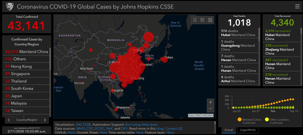
2. Johns-Hopkins University Coronavirus Dashboard (and accompanying blog)
If I was limited to one resource to share, this would be it. JHU has been at the fore-front of this outbreak since its early detection. This dashboard (created through ArcGIS Online) covers the essential information elements in an easily navigable set of maps and data.
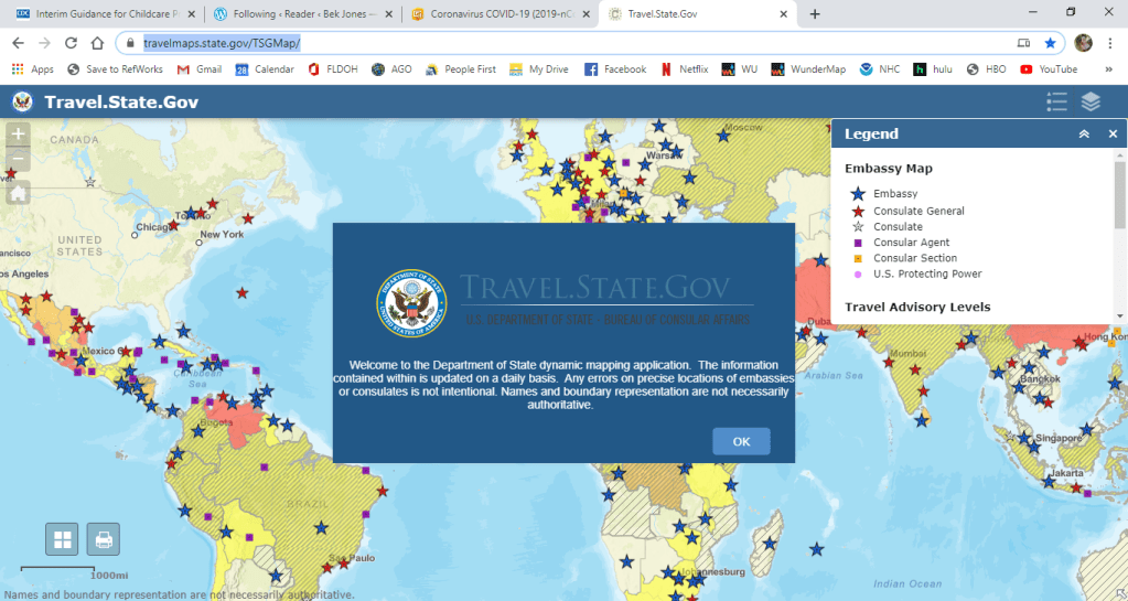
3. US Department of State – Travel Advisories Map
This map is great for measuring risk in any upcoming travel you might have planned, to understand the state of affairs in other countries, and to reach contacts abroad if you need help.
Additional data and mapping resources:
ESRI also has its own open-data portal/hub of global-to-regional GIS resources for COVID-19.
Additionally, ESRI has launched its own operations dashboard, though it is not as authoritative or as well-designed as JHU’s, in my opinion.
Click here for Guidance for K-12 Schools
Click here if you’re a healthcare official.
Click here for resources for healthcare centers and hospitals.
Click here for additional resources for state, local and tribal government resources.

