I try not to get involved in the day-to-day madness that has engulfed the United States’ government in the last three years on this blog. The mission is science, and that is as true now as it ever has been.
But when people *ahem* start altering weather maps and passing them off as real, which is a felony, as a hurricane climatologist, I take that personally.
So here is a really simple timeline with a few really simple maps to straighten this all out.
Here is a time-lapsed map showing Dorian as it moved toward and then away from Florida. You can also copy and paste the link and put it into your browser: https://www.nhc.noaa.gov/archive/2019/DORIAN_graphics.php?product=5day_cone_no_line
MAP 1: A COMPLETE HISTORY OF DORIAN AND ITS PROJECTED PATH
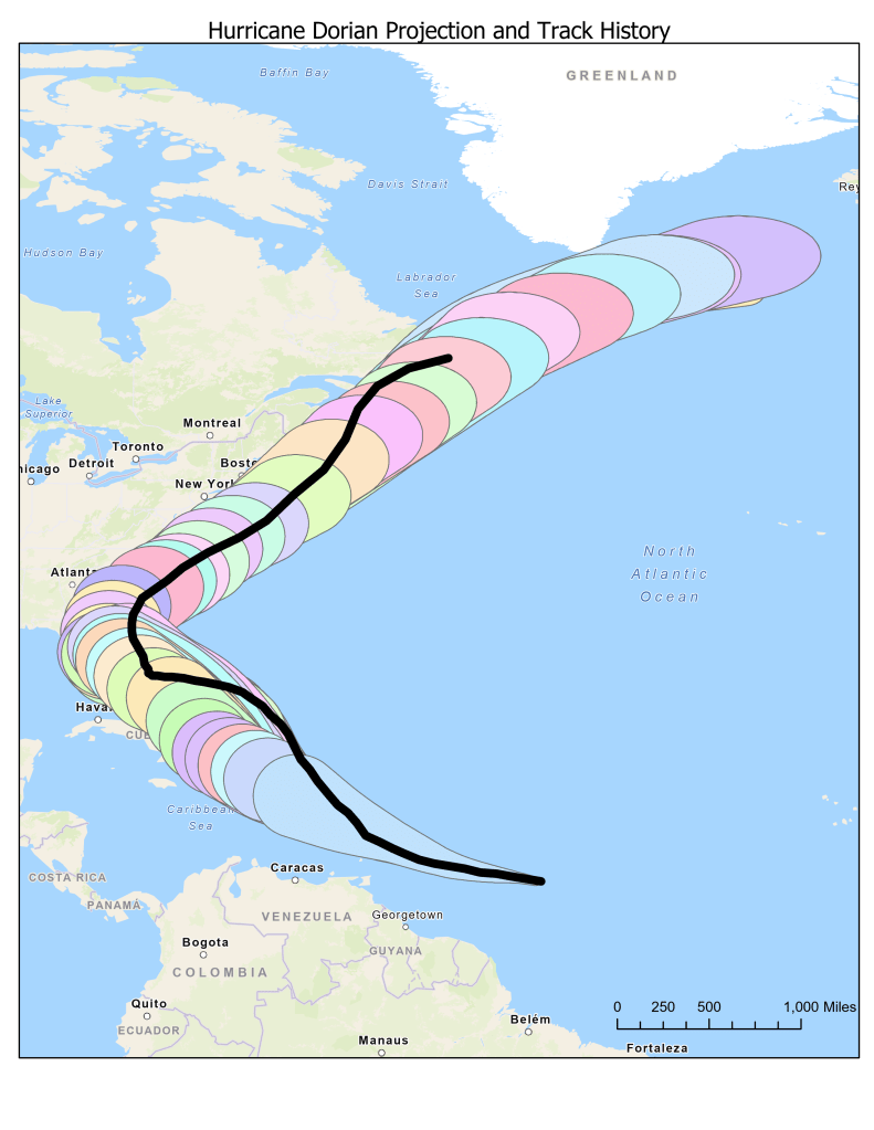
There were 64 advisories in all, which were published every six hours on the fifth and eleventh hour. Updated models were published every six hours on the second and eight hours, as per usual during non-active periods. Dorian’s actual track – the thick, black line on top of all those advisory “cones”- show that it went well within the area it was projected to with each advisory. Overall, the projections were pretty spot on, and the advisories showed that.
Each of those advisories – the color blobs stacked on top of each other- was for the five-day forecast, which is a best estimate based on a million expected and unexpected variables that can affect synoptic systems like hurricanes. At five days out, the cone widens considerably and uncertainty increases. The cone at three, four and especially five days out accounts for the possibility of change so that everyone remains on guard.
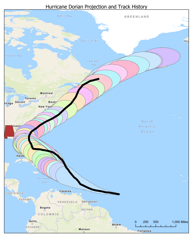
In case you’re wondering where Alabama is on this map, I’ve highlighted it in the map below. In its ever-famous crimson red, you can see Alabama – completely clear of Dorian’s projected path for every single advisory during the entire life of Hurricane Dorian.
In case you find Alabama too difficult to find on the above map, I’ve zoomed in a bit for the map below.
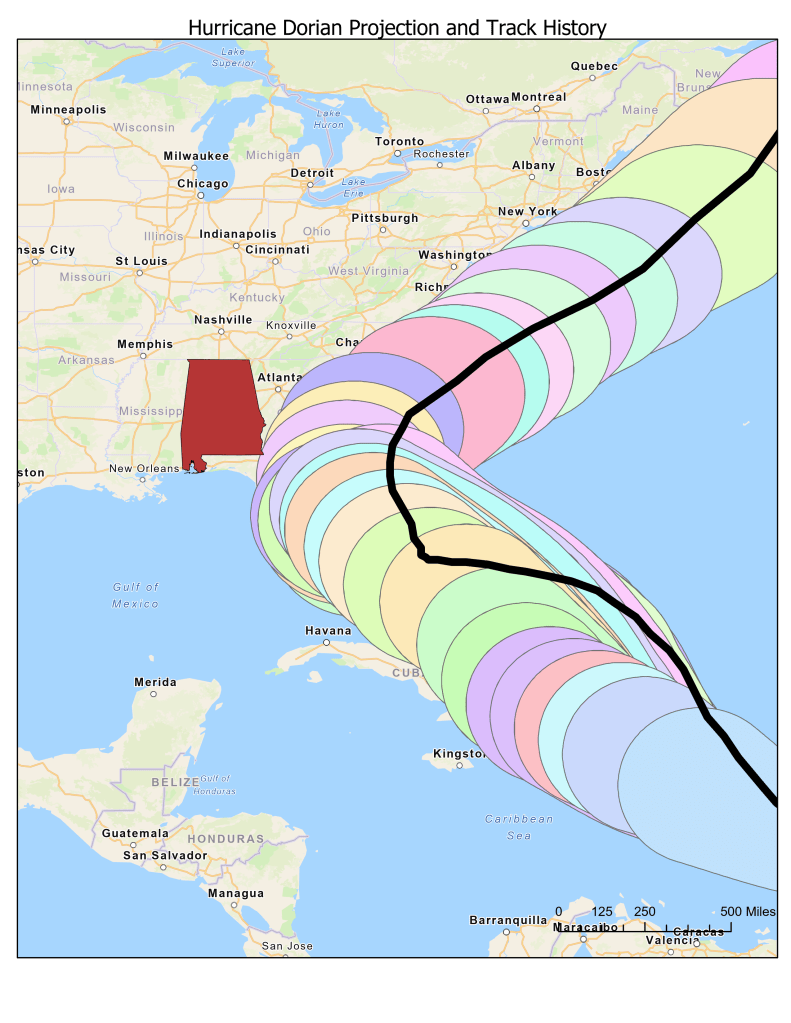
As you can see, Alabama was NEVER, at any point, in any advisory, included in the forecast cone for Hurricane Dorian. But that didn’t matter on September 1.
September 1, 2019 was a strange day.
8:00 AM: The NWS issues its latest advisory, showing Dorian as a Major Hurricane likely to staff off the East Coast entirely. This was advisory number 32A (below).
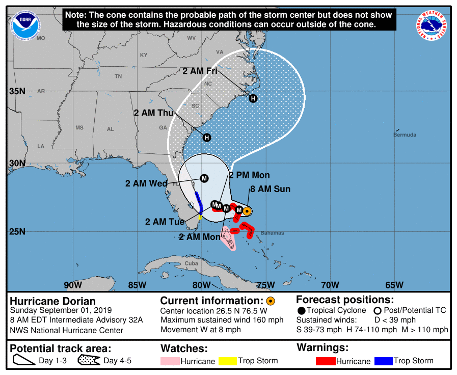
10:51 AM: Trump tweets that Alabama “will most likely be hit (much) harder than anticipated.”
11:11 AM: The National Weather Service – Birmingham Office issues a correction notifying its residents that Dorian is NOT in fact threatening people in Alabama, and the storm would remain far too East.
Later that day, Trump staffers threatened NOAA scientists not to publicly contradict Trump, even though he was wrong.
On September 4, Trump got even weirder and held a press conference in which he presented a doctored National Weather Service advisory, complete with black-sharpie edits, that extended the cone into Alabama. Again, this is a felony.
The image was a doctored advisory (number 21) from August 29 – three days and 12 advisories prior to when he made his false statement, which still did not have Alabama in the cone. He rambled on about the “original” track, even though he doctors the 21st advisory – not the first, second, or even the tenth – the 21st. There was no “original” forecast – forecasting is an active, organic process that continues as the information changes. There is no “original” projection. It’s constantly evolving.
Without going further into the politics, that’s the timeline and those are the facts.
Enjoy.

