 While updating my ArcMAP software, and wishing I had the drive space and money to download ErdasImagine, I was browsing articles written in this month’s BAMS (Bulleton of the American Meteorological Society) and NOAA sites and came across this little gem. NOAA does such a great job with its online visualizations, and I urge you to check it out.
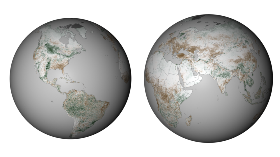
Comparing Global Vegetation in 2011 and 2012 (NOAA)
NDVI stands for normalized vegetation difference index, a technique used in remote sensing (and one of my personal favorites). I used this tool when analyzing vegetation loss on Ship Island from 1989-2010 (read more about that here).
What this map compares is the week of March 24, 2012 to that of 2011, which allows us to compare the two years in terms of spring onset.
The Northeast U.S. bloomed much earlier this year, in part because of the lack of snow cover during the winter months, allowing vegetation to begin growing because of a decrease in late winter frost.
The Southeast, on the other hand, is much, much dryer now than last year. As is much of Europe, the Sahel, large portions of China and Indonesia, Eastern Brazil and Australia. The onset of an El Nino season in late summer should provide heavy rainfalls for much of these regions, however. NOAA predicts a neutral summer season, with El Nino characteristics beginning in late summer.
Who’s faring better this year than last? Those who probably needed it the most — the horn of Africa. Last year, a drought in Somalia struck more than 10 million people — the worst drought in the region in more than 60 years. This year’s drought season is expected to be shorter and less severe in the horn, which should allow the region to breathe a little easier in light of last year’s disaster.
-30-

